Mapping real-time surface water flood risk
Over the past several decades, trends in human-driven climate and land cover change have affected extreme weather events. These human activities-related developments have significant implications for the global water cycle.
 Flooding is presently one of the major global problems which affects millions of people annually. The escalation of these events both in frequency and magnitude over the last decade is evidenced by many articles and headlines. Flooding was identified as one of the most critical environmental risks for the UK, and several research studies in the field point to growth over the following one hundred years. While in 2004, it was suggested that one in six homes in England was at risk of flooding, the likelihood of a flooding event occurring over the forthcoming five years was estimated to be somewhere between 1 in 20 and 1 in 200.
The latest UK Climate Change Risk Assessment identified surface water as the most widespread form of flooding with around 3.2 million properties are at risk in England (HM Government, 2022).
Flooding is presently one of the major global problems which affects millions of people annually. The escalation of these events both in frequency and magnitude over the last decade is evidenced by many articles and headlines. Flooding was identified as one of the most critical environmental risks for the UK, and several research studies in the field point to growth over the following one hundred years. While in 2004, it was suggested that one in six homes in England was at risk of flooding, the likelihood of a flooding event occurring over the forthcoming five years was estimated to be somewhere between 1 in 20 and 1 in 200.
The latest UK Climate Change Risk Assessment identified surface water as the most widespread form of flooding with around 3.2 million properties are at risk in England (HM Government, 2022).
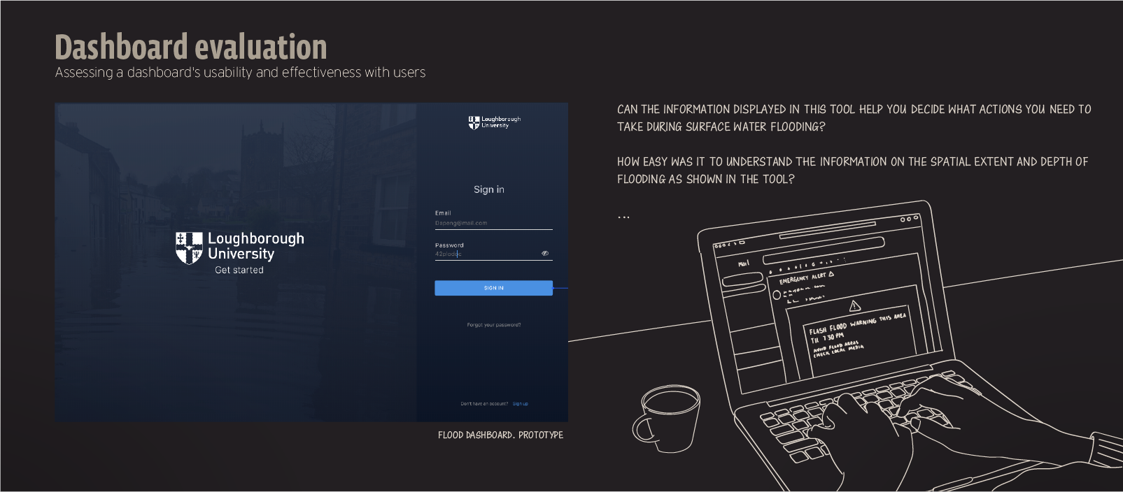
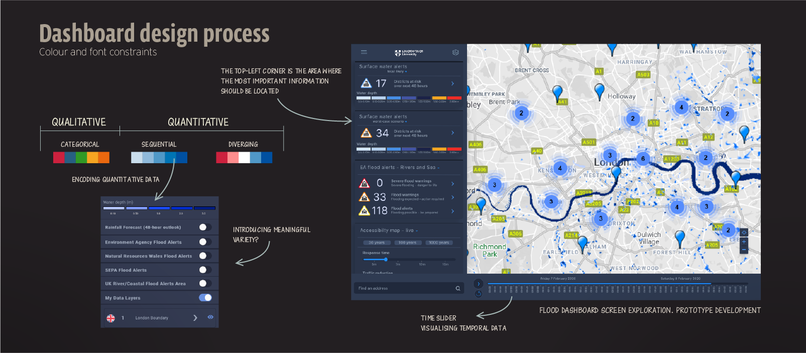 A dashboard is a visual display of the most important information needed to achieve one or more objectives, consolidated and arranged on a single screen so that the information can be monitored at a glance. The top-left corner is the area where the most important information should be located. The panel on the left-hand side controls what is displayed on the map.
“There are many visual design guidelines but the basic principle might be summarised as the Visual Information Seeking Mantra”
"Overview first, zoom and filter, then details-on-demand" (Shneiderman, 1996)
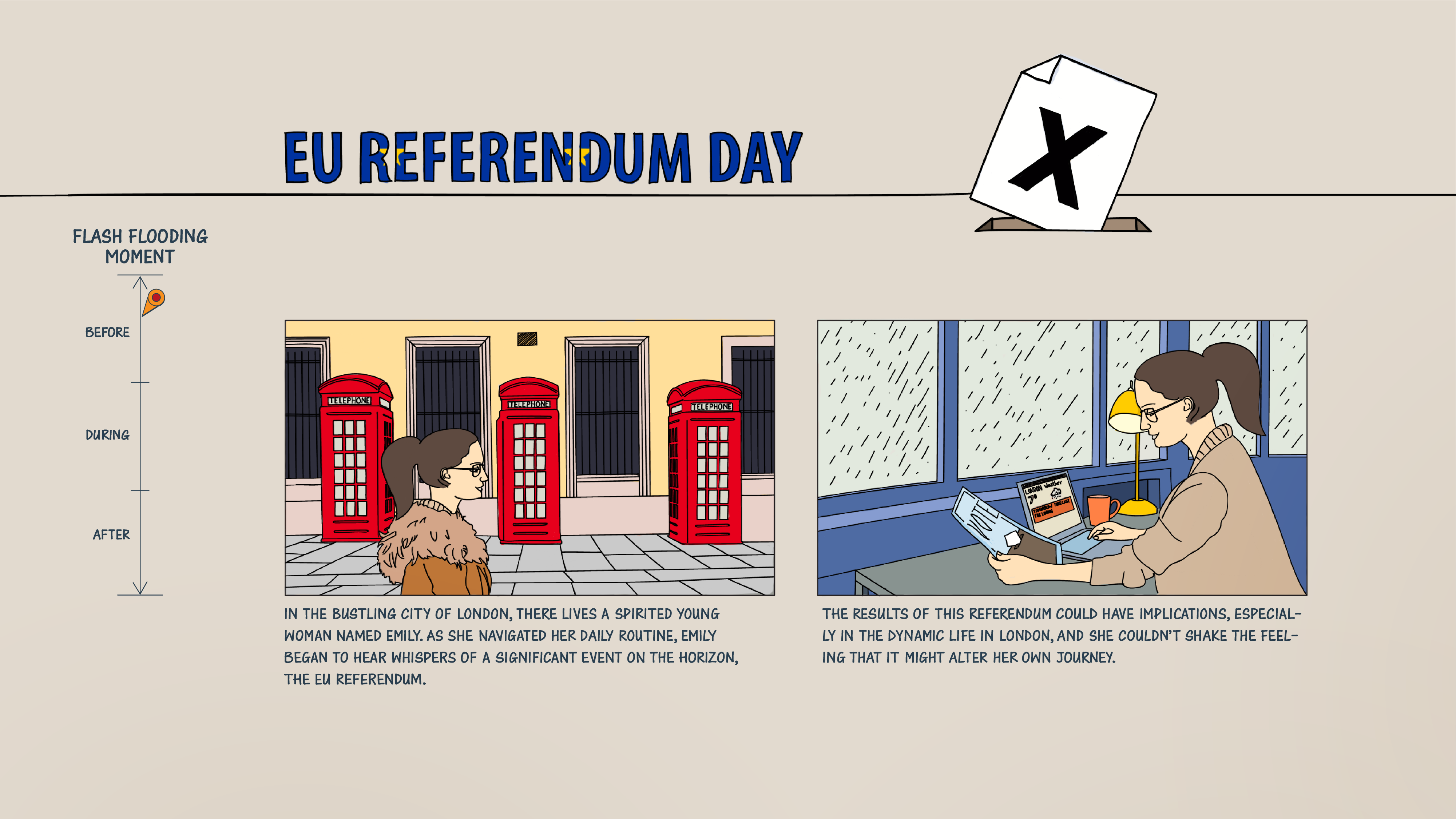
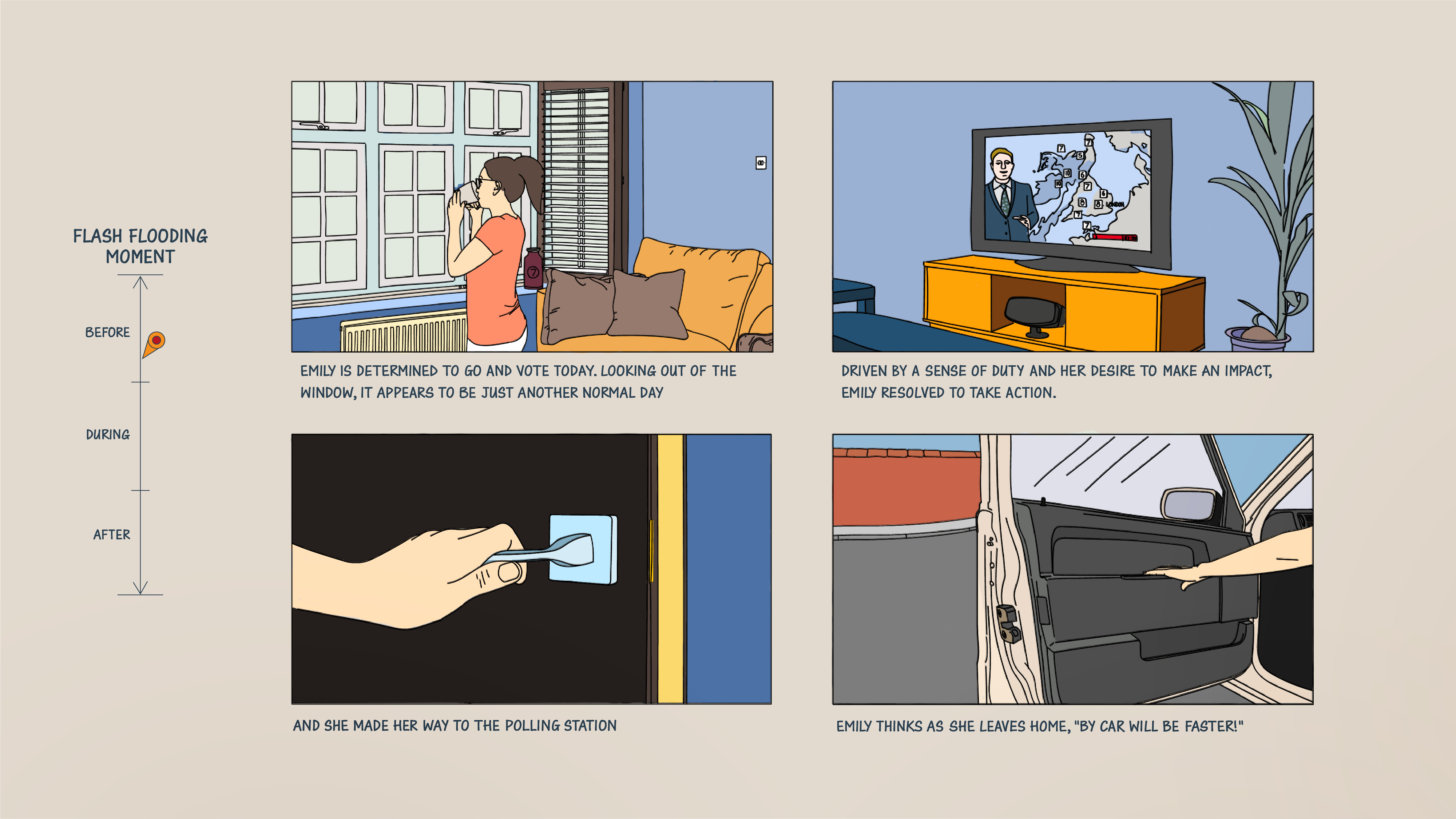
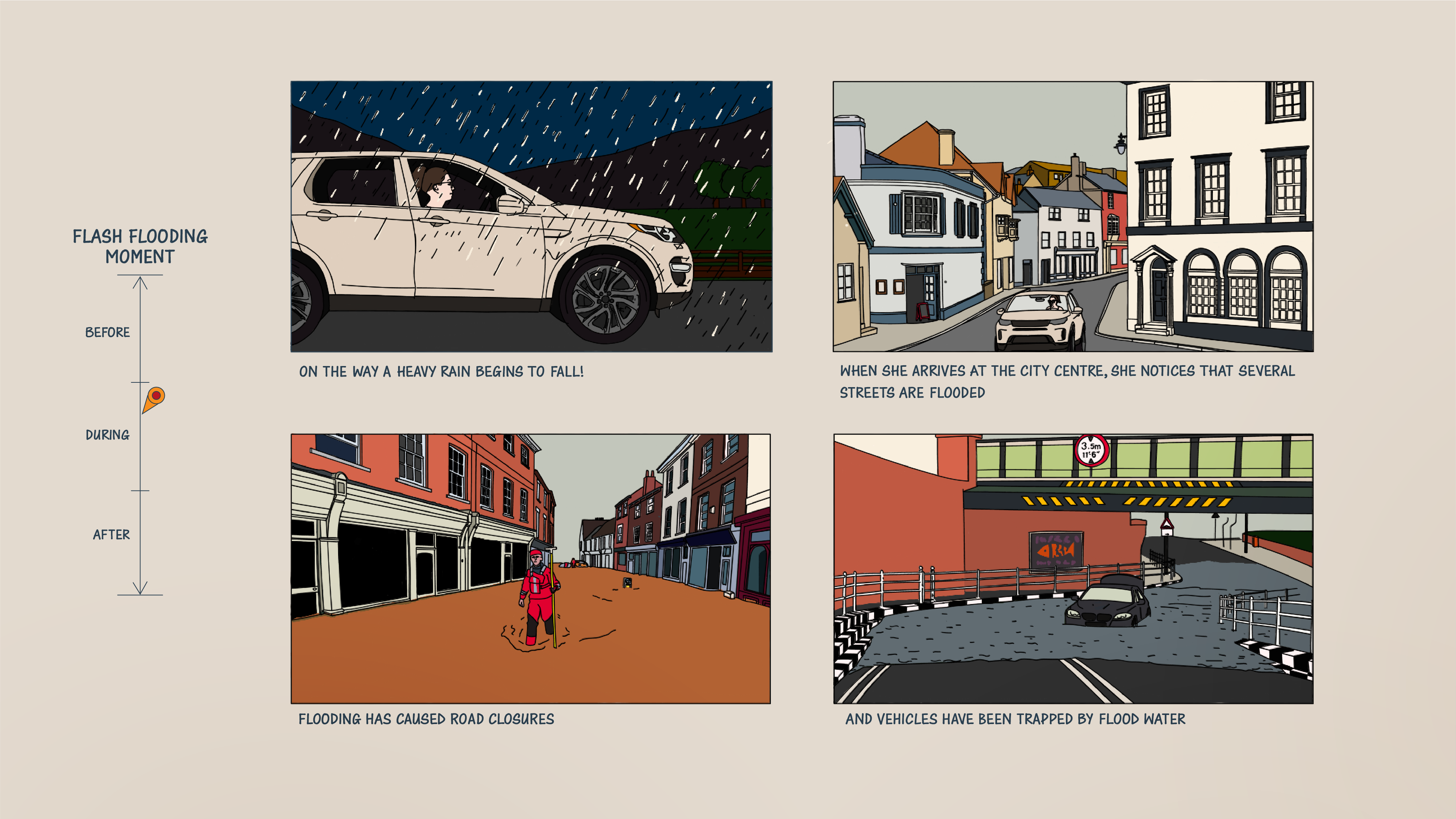
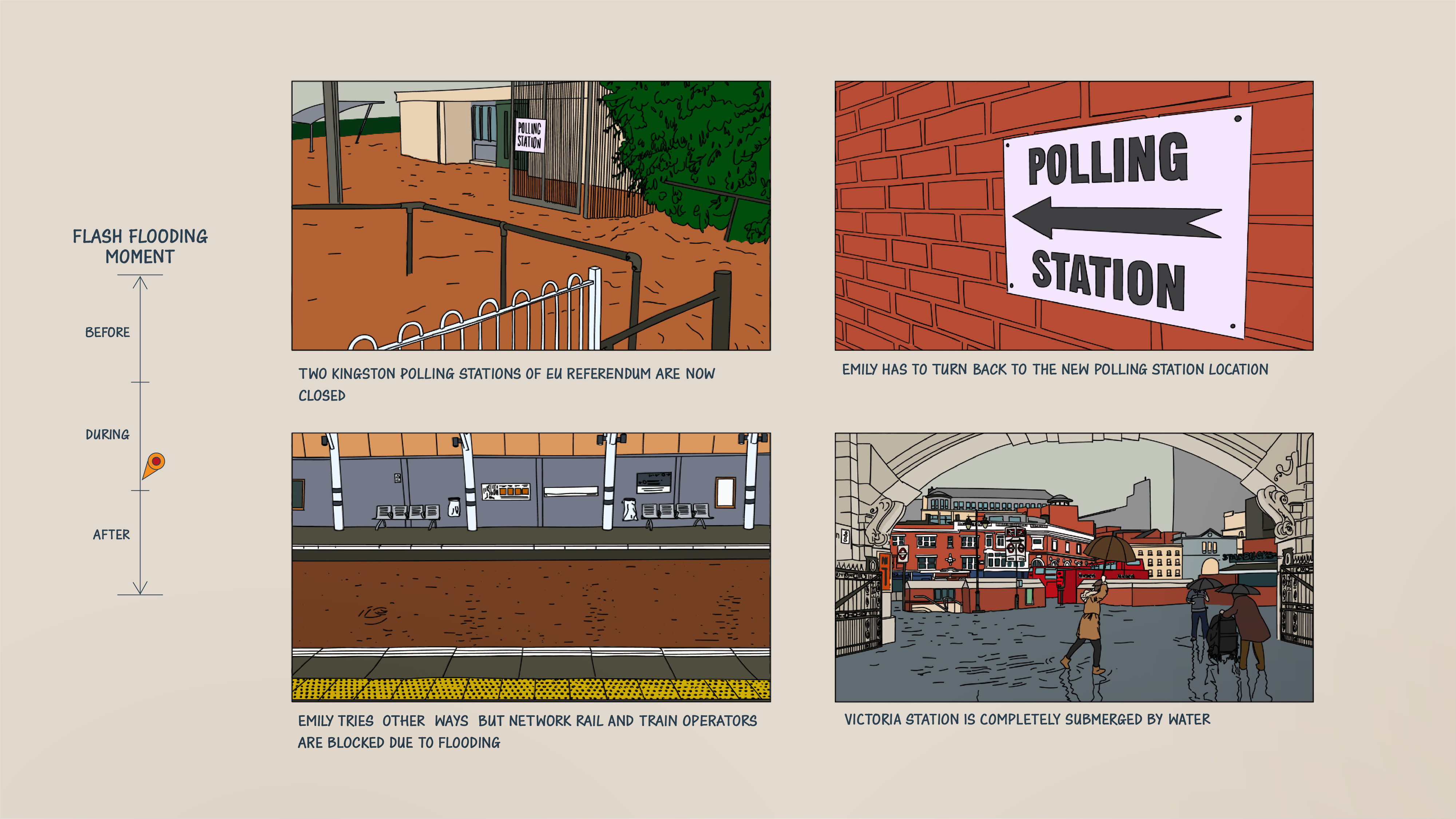
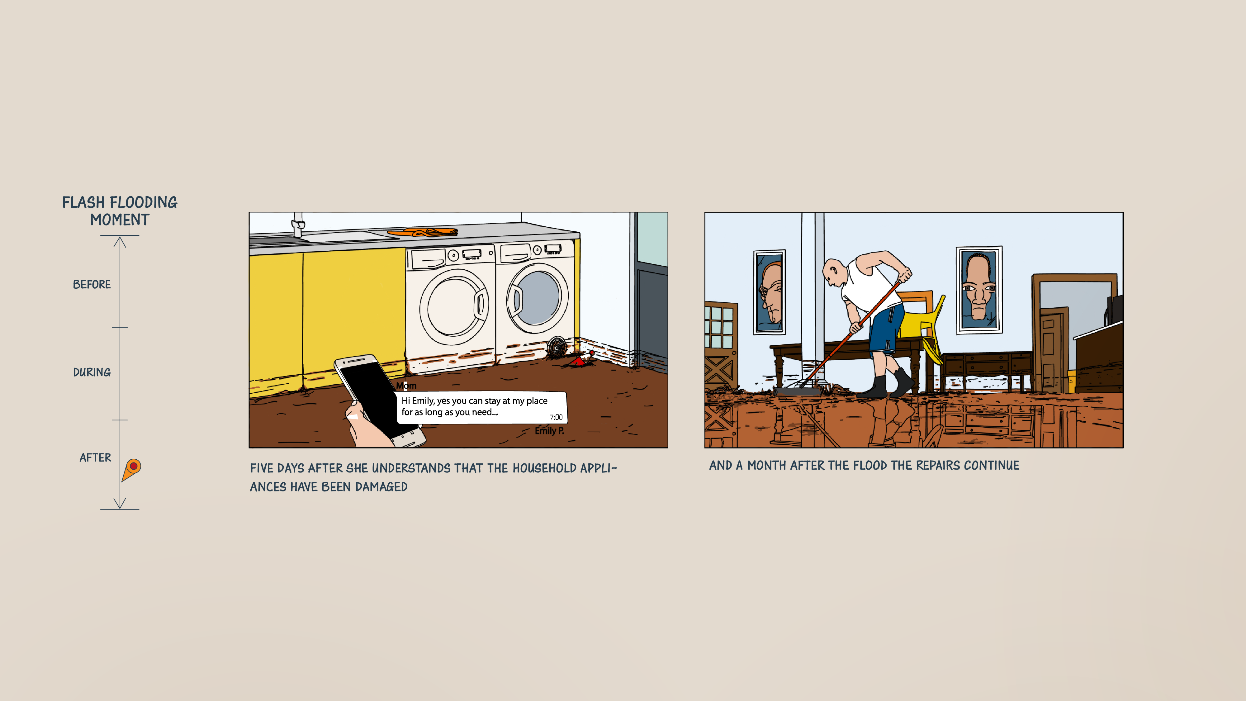
This study uses a storyboard as an approach to provide a representative picture of the specific challenges and actions for flood managers during a flash flood event. This method intends to promote participants' involvement in the event from a practitioner’s viewpoint, generate critical actions and ideas, and express their needs. In this interdisciplinary construction of the storyboard, the socio-economic impact and a flood event were combined in the narrative to develop a heuristic tool that can enhance the experience and promote dialogue to unlock decision-makers' knowledge.
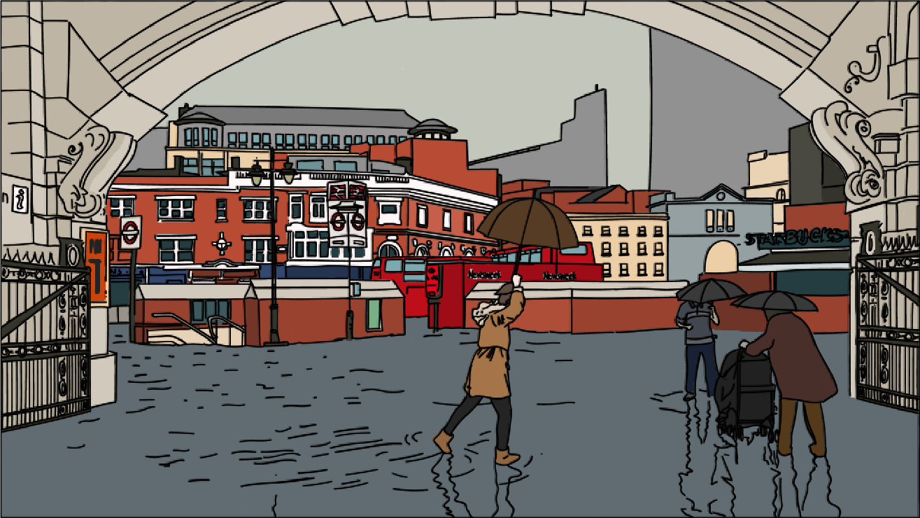
The storyboard narrative is based on the EU referendum polling day flood event of 2016 to represent a major flooding event, thereby ensuring physical consistency and consistent spatiotemporal variability. As a society, we hold a collective memory of past extreme weather events. Commonly, these occurrences have left a lasting impact, reminding the importance of understanding the specific risks and vulnerabilities of the community, as well as the potential impact of different courses of action.
The narrative is used as a plot to tell a flood story over a period of time, and it is divided into three moments: before, during and after the flood event. The information on the time and the times that are launched the new predictions were indicated at the top of the boards. This approach facilitated linking events to actions and enabled understanding of whether the information is needed and which actions are necessary to be triggered at these different moments.
A dashboard is a visual display of the most important information needed to achieve one or more objectives, consolidated and arranged on a single screen so that the information can be monitored at a glance. The top-left corner is the area where the most important information should be located. The panel on the left-hand side controls what is displayed on the map.
“There are many visual design guidelines but the basic principle might be summarised as the Visual Information Seeking Mantra”
"Overview first, zoom and filter, then details-on-demand" (Shneiderman, 1996)
This study uses a storyboard as an approach to provide a representative picture of the specific challenges and actions for flood managers during a flash flood event. This method intends to promote participants' involvement in the event from a practitioner’s viewpoint, generate critical actions and ideas, and express their needs. In this interdisciplinary construction of the storyboard, the socio-economic impact and a flood event were combined in the narrative to develop a heuristic tool that can enhance the experience and promote dialogue to unlock decision-makers' knowledge.
The storyboard narrative is based on the EU referendum polling day flood event of 2016 to represent a major flooding event, thereby ensuring physical consistency and consistent spatiotemporal variability. As a society, we hold a collective memory of past extreme weather events. Commonly, these occurrences have left a lasting impact, reminding the importance of understanding the specific risks and vulnerabilities of the community, as well as the potential impact of different courses of action.
The narrative is used as a plot to tell a flood story over a period of time, and it is divided into three moments: before, during and after the flood event. The information on the time and the times that are launched the new predictions were indicated at the top of the boards. This approach facilitated linking events to actions and enabled understanding of whether the information is needed and which actions are necessary to be triggered at these different moments.
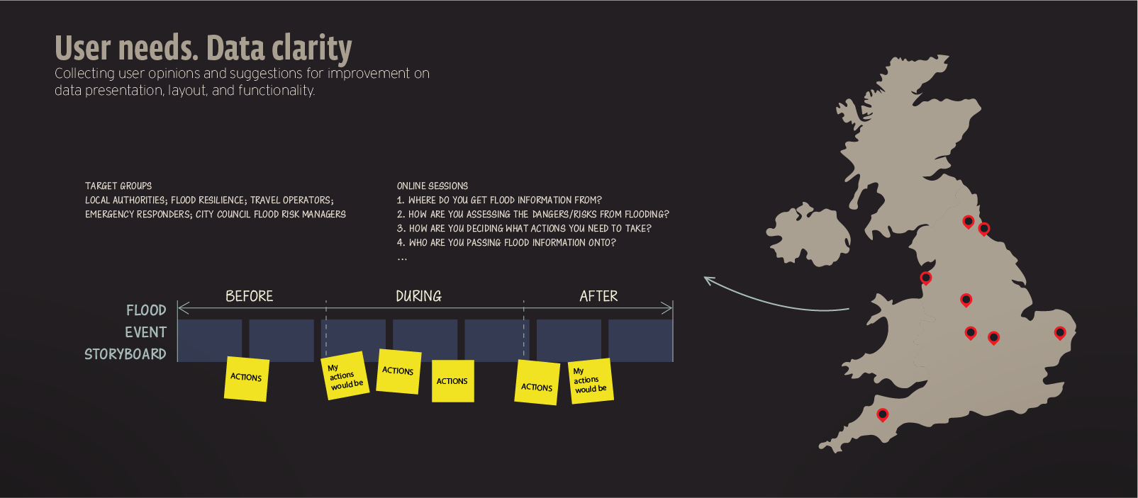 A qualitative method was chosen to allow participants to share their experiences, understand their actions and identify their specific information needs throughout a flash flood event. A participatory session strategy was carried out with professionals in the field of flood risk management (strategic and emergency planners) in the UK.
The criteria for the target decision were that participants must have a practice background in flood management. Expertise gained through experience and personal observation as an informal process in knowledge acquisition. Collecting user opinions and suggestions for improvement on data presentation, layout, and functionality and identifying what the metrics/context are for measures. Identifying information that really matters.
A qualitative method was chosen to allow participants to share their experiences, understand their actions and identify their specific information needs throughout a flash flood event. A participatory session strategy was carried out with professionals in the field of flood risk management (strategic and emergency planners) in the UK.
The criteria for the target decision were that participants must have a practice background in flood management. Expertise gained through experience and personal observation as an informal process in knowledge acquisition. Collecting user opinions and suggestions for improvement on data presentation, layout, and functionality and identifying what the metrics/context are for measures. Identifying information that really matters.
 Dashboards are most often used to monitor processes and situations that require a timely response. The nowcasting prototype used in this study included multiple alerts from external organisations such as the Environment Agency and SEPA and was updated every 3 hours with the status of the flood, its location, the time it will occur, and its depth.
Most participants had difficulty identifying the precise moment in the storyboard when they would make their decisions. One participant concluded: “Currently, it is difficult to determine what multi-agency actions should be undertaken as we could effectively be wasting our time if we turn out for every anticipated event, and a level of complacency could creep in”. Commonly, there is a trend to wait for a repeated warning closer to the event to increase confidence to act. When confidence is not present, the actions tend to be of a more reactive nature and commonly, the first responders to these events are the public.
A majority of participants expressed the need for more visual information, such as infographics and heatmaps. “More visual, it's easier to understand, and it's a fast-moving situation, it's easier actually to see”.
References
Shneiderman, B. (1996) "The eyes have it: a task by data type taxonomy for information visualizations," Proceedings 1996 IEEE Symposium on Visual Languages, Boulder, CO, USA, pp. 336-343
Dashboards are most often used to monitor processes and situations that require a timely response. The nowcasting prototype used in this study included multiple alerts from external organisations such as the Environment Agency and SEPA and was updated every 3 hours with the status of the flood, its location, the time it will occur, and its depth.
Most participants had difficulty identifying the precise moment in the storyboard when they would make their decisions. One participant concluded: “Currently, it is difficult to determine what multi-agency actions should be undertaken as we could effectively be wasting our time if we turn out for every anticipated event, and a level of complacency could creep in”. Commonly, there is a trend to wait for a repeated warning closer to the event to increase confidence to act. When confidence is not present, the actions tend to be of a more reactive nature and commonly, the first responders to these events are the public.
A majority of participants expressed the need for more visual information, such as infographics and heatmaps. “More visual, it's easier to understand, and it's a fast-moving situation, it's easier actually to see”.
References
Shneiderman, B. (1996) "The eyes have it: a task by data type taxonomy for information visualizations," Proceedings 1996 IEEE Symposium on Visual Languages, Boulder, CO, USA, pp. 336-343